VERIZON NOTIFICATION CENTER
PROCESS: Research, Ideate, Wireframe, Visual Design, User Testing
ROLE: UX Designer
TIME: February 2018 - 3 weeks
CHallenge
Currently not leveraging app notifications as means to deliver a superior customer experience.
SOLUTION
- Create a notification/message center where users can see all of their important and other messages.
- Understand user needs and what they prioritize as a notification
- Card sort notifications that will be launched
- User test to see which design has the most intuitive flow
RESULTS
Initial launch: April 2018
Full release: June 1018
Whiteboarding & Research
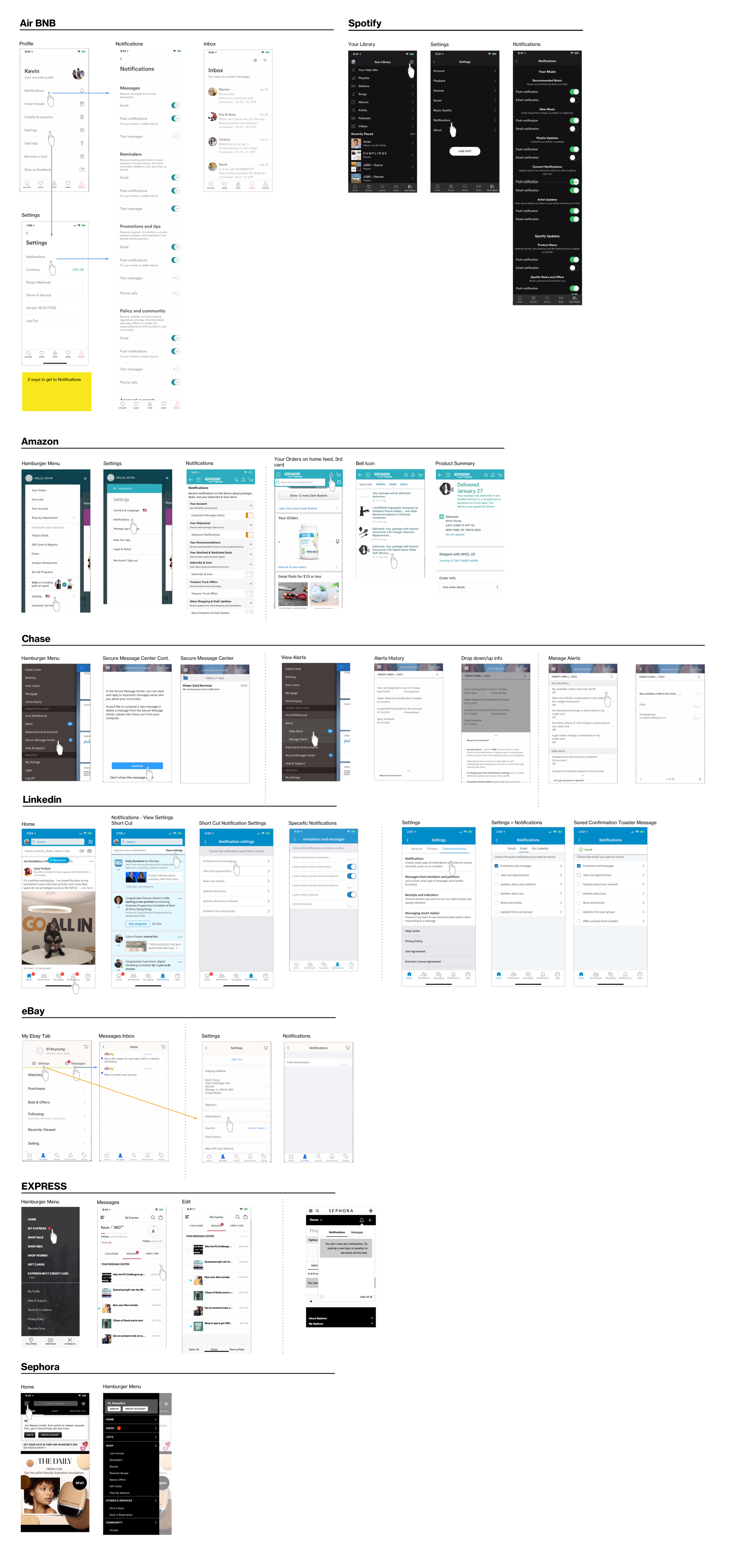
Looking at other apps
Researching how other apps utilize their notifications gave insight on how to approach this project - Seeing what they're doing well and how it could be implemented into the Verizon platform.
wires and flows
Making sure to wire what was possible within the brand guidelines and also the ecosystem of the existing app. These are multiple approaches to implement a notification center and shows the possible steps a user would take to access the entry point.
Wireframe flow 1
Wireframe flow 2
Options and flows
Wires version 2
Each week there is a presentation where designers share their progress and what they're working on to get feedback. After receiving feedback from my initial wireframes, I created these wires after knowing other constraints and possibilities. There was discussion on whether or not to use a red blip on the hamburger to indicate a notification or a new bell icon in the nav.
Nav options
Notifications_v2
FINAL SCREENS and prototyping
User testing
After prototyping the two options, a red dot on the hamburger menu and bell icon, we decided to go with hamburger menu option after user testing.


